There’s nothing at all wrong with this sign. In fact, it is delightfully right. In a Lewis Carroll sort of way.
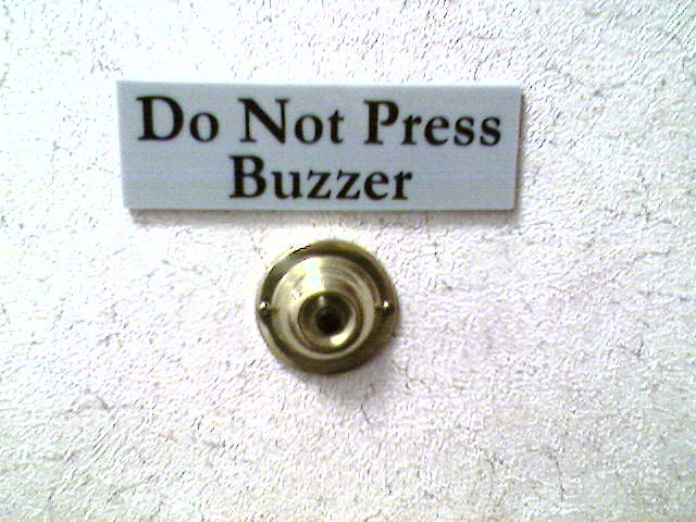
I snapped this one myself in a medical office building.
There’s nothing at all wrong with this sign. In fact, it is delightfully right. In a Lewis Carroll sort of way.

I snapped this one myself in a medical office building.
Are these quotation marks or just… graphical exuberance?

Seriously, peeps, this one’s better than espresso.
Before I begin, let me just state that I am proud of this fine grocery establishment for attempting to encourage its customers to go green. Even if the point is also to sell cloth bags. That said…
First we have the sign as a whole:
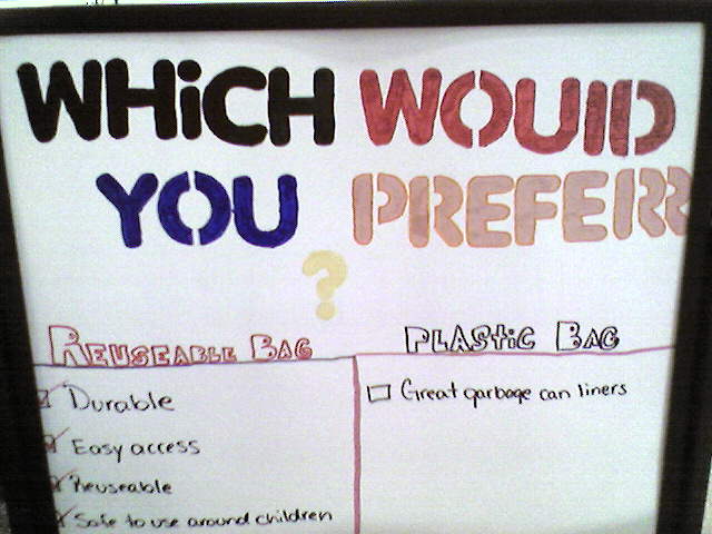
So, let’s see. We have some bizarre capitalization, multiple (incorrect) iterations of “reuseable,” and… whatever that is going on with that letter “r,” there.
And further down the list, we find this:
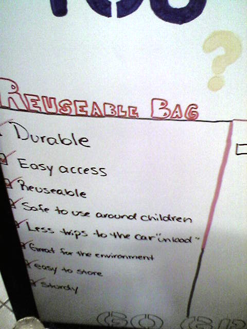
Yes, that’s right. “Less trips to the car ‘unload’.” Obviously the first bit should be “fewer,” but I am not sure what’s going on with the unload stuck on the end, or with the random quotation marks around it.
NOICE.
(That’s her wording, not mine!)
Sarah found this in her inbox.
![]()
Normally I include typos of the e-mail variety in my “free pass” mental category, not least because I make so many typos myself, and sometimes I just don’t care enough to correct them. But this is an ad for a business, and so it passes.
O YE BUSINESSES OF THE WORLD, WHY DO YE NOT HIRE COPY-EDITORS?
Just asking.
I’m definitely not the first to write about this, but I am the proud photographer of the following image. This goes in the “proof that I’m not humorless about words” file, because this? Is awesome. Welcome to the “Recombobulation Area.”
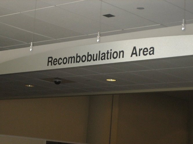
I nabbed this in the lovely Milwaukee airport last week. In case you can’t quite figure it out, it’s a pleasant area of benches and tables and such immediately after the chaos that is airport security. I just love that in such an inherently humorless situation, someone came up with this — and was permitted to carry it out!
Okay. I see this mistake, or similar ones, all the time. Let’s break it down.
So this image is clearly wrong:
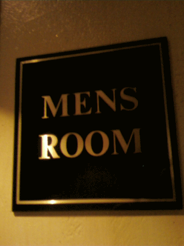
It’s wrong because “mens” is not a word. That’s pretty clear-cut. But then there’s this:
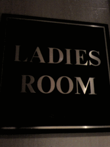
This one drives me nuts. “Ladies” is, in fact, a word. And in a bizarre way, “ladies room” could be a debatably correct construction. But in this case it’s clearly wrong, because it’s in parallel with “mens,” indicating that the aim was possessive declarations in both cases. Right? Am I missing something?
Ethan found this one last summer “in cambridge (our fair city) MA.” And yes, Ethan, when I read that, I’m pronouncing “MA” as “mah.” 🙂
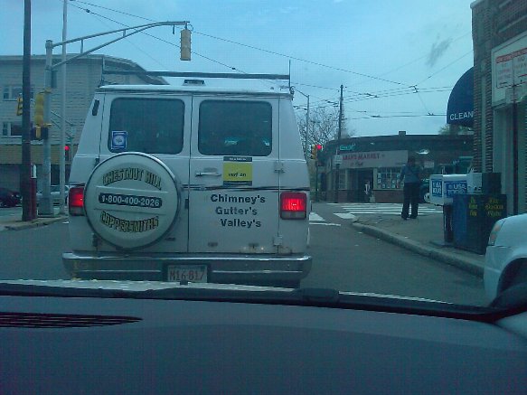
This appears to have been taken by the passenger, but just in case: I’m pretty sure Dewey, Cheatem and Howe would want me to point out that photographing Red Pen errors while driving is a no-no.
Reporter #1 Sarah found this lovely homophone mishap at a local sportsman’s club.

She quips, “If you want one that’s spelled correctly, though, they cost a dollar.”
It is the only explanation for why I keep missing submissions that are very clearly in my in-box. I don’t think “mea culpa” even covers it any more.
ANYWAY… the fabulous “conversation” feature of gmail has allowed me to realize that Lauren, giver of yesterday’s gift, actually sent me another lovely “oops” way back in April, which she found in a WordPress sidebar.
![]()
This one could actually be a subject-verb issue — but I’m probably just trying desperately to keep it from being yet another stupid apostrophe moment. SIGH.
The lovely Lauren over at Ballywick (to whose very clever twelve-step program I linked back in April) submits this, noting “It’s a five-alarm fire!”
![]()
This is going to crack me up all day. I’ve always loved the construction “fool X,” as in, “Those fool dogs keep chasing the squirrels right into the fence.” I love imagining what might cause someone to refer to “fool bathrooms.”
Thanks, Lauren!